
“A brand should know who it is, and why it exists.”
Branding at Haus Laux helps people articulate who they are and what they make. We work closely with clients to understand their work, values, and context, building brand foundations that feel clear, thoughtful, and true.
Our approach blends intuition and strategy with a strong visual sensibility. Through typography, color, and structure, we create identities that feel cohesive, lived in, and built to grow.


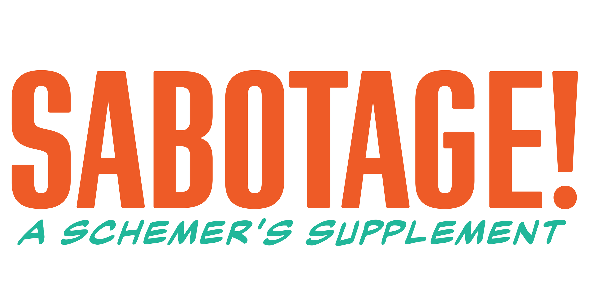
Haus Laux partnered with Arkive Gaming to develop a brand system built for range and longevity. Arkive needed an identity that could live across tabletop and future digital spaces, without being tied to a single format, genre, or moment in time. The result is a contemporary, confident brand that remains grounded as the studio evolves.
Our work focused on creating a flexible visual foundation to support Arkive’s current supplements and future ambitions. The tagline Upgrade Your World. Enhance Your Game. grew from this approach, capturing the studio’s focus on elevating existing systems while leaving room for original work to come. The final identity is modern, adaptable, and built to scale as Arkive Gaming continues to grow.

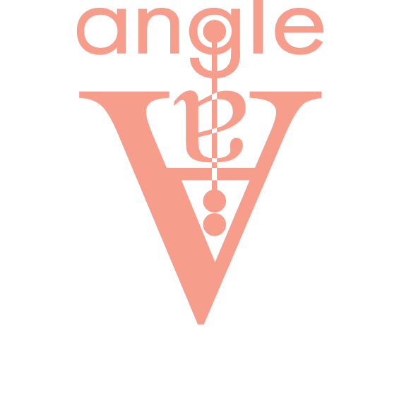
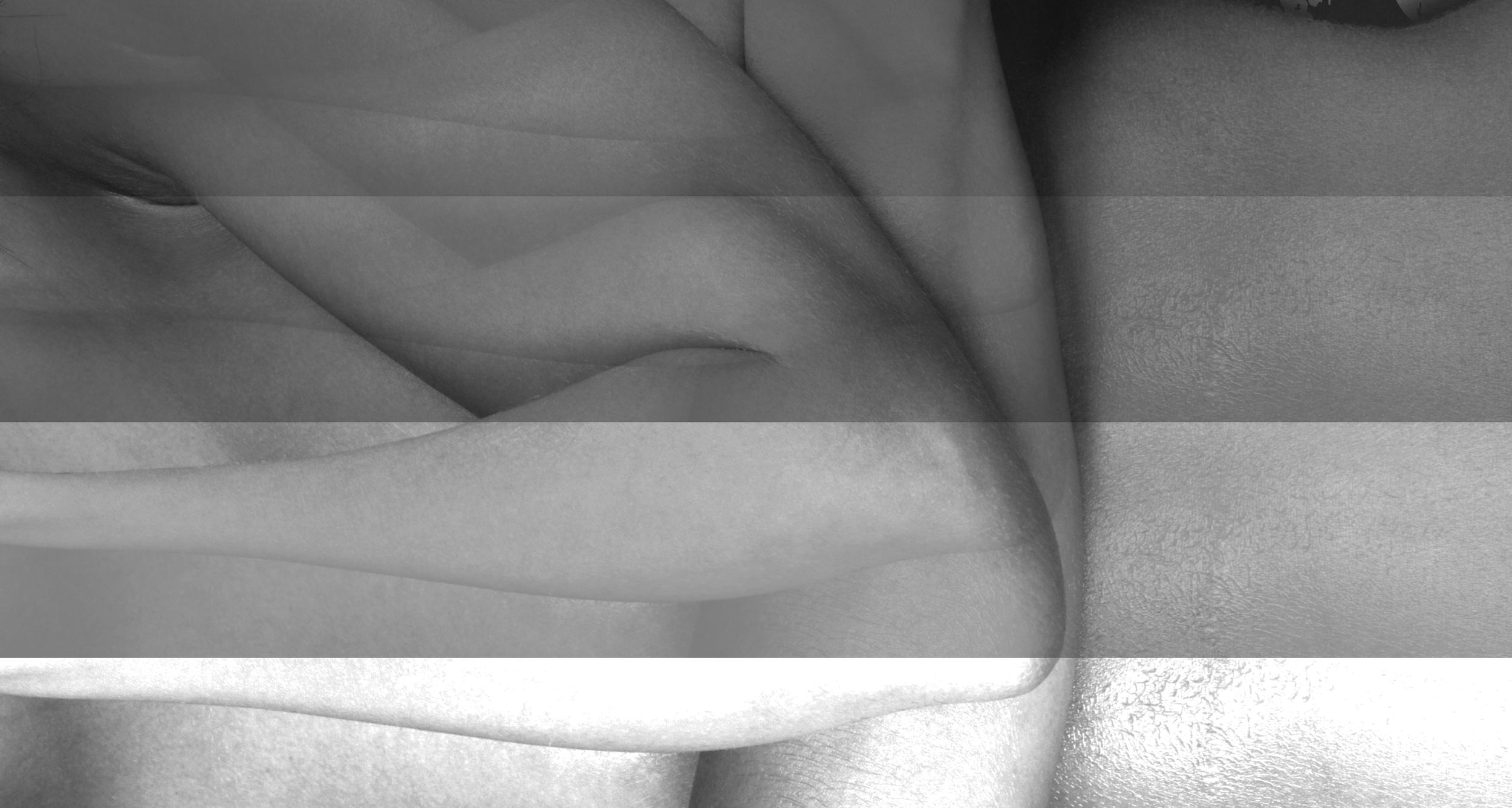
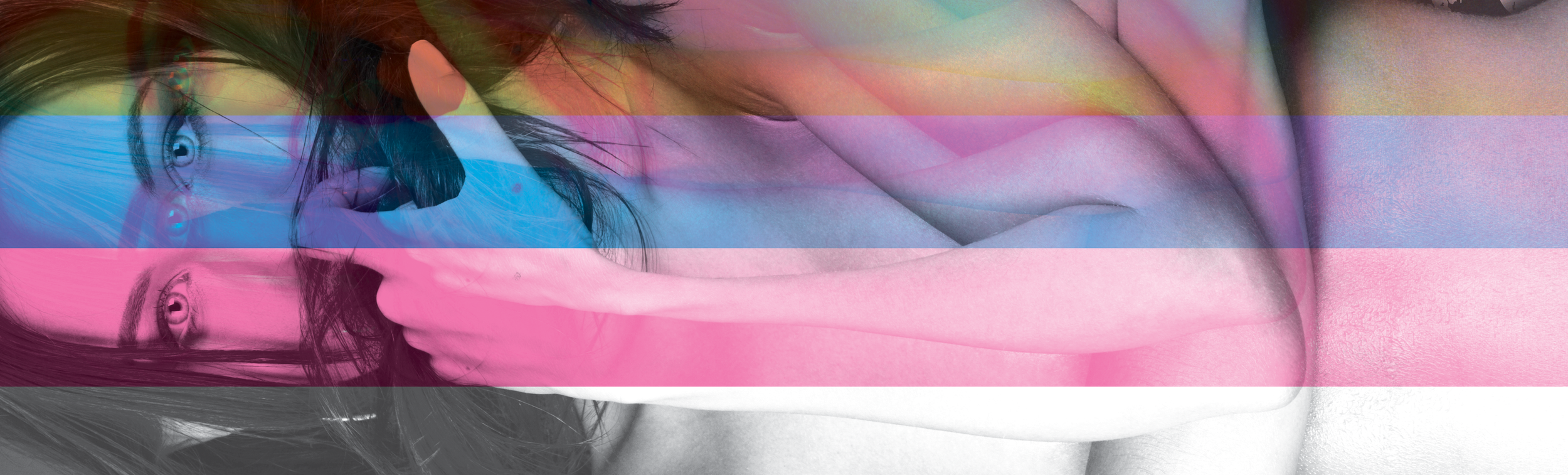
Photographing the angles you miss.
Haus Laux worked with Angle A to shape a brand grounded in observation, instinct, and point of view. The focus was on fleeting moments that are often felt before they are seen, captured in the phrase Photographing the angles you miss. It reflects Angle A’s patient, intuitive approach and their belief in letting moments lead.
The identity was built to be flexible and everlasting. Designed to function as both a logo and an icon, the mark moves easily across digital and print, supported by a subtle, timeless color palette that stays quietly vibrant.
The result is a brand that mirrors how Angle A works. Unforced, observant, and emotionally driven. Built to leave space for life as it unfolds.